The short answer
An accessible website is one that people can use whatever their eyesight, hearing, movement or way of thinking, and whatever they happen to be using to reach it. Somebody who cannot see the screen, cannot hold a mouse steady, or finds dense text hard going should still be able to find out what you do, see your prices and get in touch.
For a small business that is not a large project. The problems that shut people out are, overwhelmingly, the same handful: text too faint to read, images with no description, form fields with no label, buttons that only work with a mouse. Each one is a decision somebody made, or forgot to make, when the site was built.
Get those right and you have done most of what matters. You will also, almost by accident, have a site that is easier to read on a phone in sunlight, clearer to search engines, and quicker for everybody to use.
The one line version
Accessibility is not a feature for a few visitors. It is whether your website works, tested against the full range of people who might want to buy from you.
Who it is actually for
It is easy to picture accessibility as something for a small group of people with specialist equipment. The numbers say otherwise. The government's Family Resources Survey found that 16.8 million people in the UK were disabled in 2023 to 2024, which is a quarter of the population, up from 11.9 million ten years earlier.
Not all of that affects how somebody uses a website, but a great deal of it does. Colour Blind Awareness puts the number of colour blind people in the UK at about 3 million, roughly one in twelve men and one in two hundred women. Add people with sight loss, dyslexia, arthritis, tremors, hearing loss, anxiety, and the ordinary effects of getting older, and you are describing a large share of any small business's customers.
Then there is everybody whose difficulty is temporary or down to circumstance, which at some point is all of us:
| Who | What gets in the way | What helps |
|---|---|---|
| Somebody with low vision | Faint grey text, small type, pages that break when zoomed | Strong contrast, text that can be enlarged, layouts that reflow |
| Somebody who is blind | Images with no description, buttons with no name, headings used for looks | Alt text, labelled controls, a proper heading structure |
| Somebody who is colour blind | Errors shown only in red, links shown only by colour | Words and icons alongside colour |
| Somebody who cannot use a mouse | Menus and pop ups that only respond to a mouse | Everything reachable and usable by keyboard |
| Somebody with dyslexia | Long blocks of justified text, capitals, jargon | Short paragraphs, plain words, left aligned text |
| Somebody deaf or hard of hearing | Videos with no captions | Captions, or the same information in writing |
| Somebody with a broken wrist | Tiny links that need precise tapping | Large tap areas, well spaced |
| Somebody outside in bright sun | Low contrast that vanishes in glare | The same strong contrast that helps low vision |
The last two rows are the point. Nearly every change that helps a disabled visitor helps somebody else as well. Designers call this the curb cut effect, after the dropped kerbs that were built for wheelchair users and turned out to be used by everybody with a pushchair, a suitcase or a bike.
Why it is worth your time
It is a lot of customers
The disability organisation Purple, citing research by the University of Bristol, puts the combined spending power of disabled households in the UK at £446 billion a year. A business that is hard for those households to use is turning some of that away without ever knowing.
It does happen. The Click-Away Pound survey of 2019 estimated that £17.1 billion in potential sales were lost when disabled shoppers gave up on retail websites they found inaccessible. That survey looked at online shops, but the behaviour is the same for a plumber's quote form or a salon's price list. People rarely ring up to complain that your contact form did not work with their screen reader. They go to the next business on the list.
It overlaps with being found
A surprising amount of accessibility work is the same work that helps search engines understand a site. A search engine cannot see a photograph either, so it reads the alt text. It relies on headings to understand what a page is about, and on the page title to know what to call it. Links that say what they lead to help a crawler as much as a person listening to them.
Accessibility is not a ranking trick and nobody should sell it as one. But a site built properly for people who use screen readers tends to be a site built properly, full stop. We go through what search engines actually reward in getting found on Google.
It is simply a better site
Clear text, obvious buttons, forms that explain what went wrong, pages that work on a phone: none of these are compromises. They are what good design looks like. The sites that do worst on accessibility are usually the ones that are also frustrating for everybody, just less visibly.
What the law says
Not legal advice
This is a plain English summary to help you understand where websites fit, not legal advice. How the law applies depends on your business and where you trade, and if you have a specific concern a solicitor or the Equality Advisory and Support Service is the right place to ask.
In Great Britain the relevant law is the Equality Act 2010. Section 29 says that anybody providing a service to the public, whether they charge for it or not, must not discriminate against a person who needs that service. The same section applies a duty to make reasonable adjustments to service providers.
The Act does not mention websites by name, and it does not set a technical standard. But a website is one of the main ways most businesses provide their service now, and the government's own guidance is plain about who the duty covers: all UK service providers have a legal obligation to make reasonable adjustments under the Equality Act 2010, or under the Disability Discrimination Act 1995 in Northern Ireland.
What that means in practice for a small business is not that every page must pass a formal audit. It is that you should not be putting unnecessary barriers in the way of disabled customers, and where there is a barrier you cannot remove straight away, there should be another reasonable way to get the same thing done.
The rules you may have heard about
There are specific website accessibility regulations in the UK, and they are strict: they require WCAG 2.2 at level AA and a published accessibility statement. They apply to public sector bodies, such as councils, government departments and some charities, not to private businesses. They are still a useful yardstick, because they show what a thorough standard looks like.
If you sell online to customers in the European Union, it is also worth reading about the European Accessibility Act, which lists e-commerce among the services it covers. Whether and how it applies to you depends on the size of your business and what you sell, so check the detail before assuming either way.
WCAG, in plain English
When people talk about an accessible website, the standard they almost always mean is the Web Content Accessibility Guidelines, or WCAG, published by the W3C, the body that looks after the standards the web runs on. The current version is WCAG 2.2, published on 5 October 2023, and a site that meets it also meets the earlier 2.1 and 2.0.
WCAG is long and written for specialists, but it rests on four simple ideas. The government's guide to understanding WCAG puts them well:
- Perceivable. People can take in the content with whichever senses they use. Photographs have text descriptions, videos have captions, and text stands out clearly from its background.
- Operable. People can move around and use everything, however they get about a page, including by keyboard alone.
- Understandable. The words are clear, things behave consistently, and forms explain what they need.
- Robust. The site is built in a way that assistive technology, such as screen readers, can reliably make sense of.
Each guideline is broken into checkable requirements, and each requirement has a level:
| Level | What it means | Who aims for it |
|---|---|---|
| A | The minimum. Without it, some people cannot use the site at all | Everybody, as a floor |
| AA | The level most guidance points to. Removes the most common barriers | The public sector must meet it, and it is the sensible target for any business |
| AAA | The strictest. Not always possible for every kind of content | Specialist services, for particular pages or audiences |
You do not need to read WCAG to run a small business website. What you need is for whoever builds it to know it, and for the handful of requirements that trip most sites up to be handled properly. Those are what the rest of this guide covers.
Most websites fail the basics
Every year the web accessibility organisation WebAIM runs automated tests on the home pages of the top one million websites. The February 2026 WebAIM Million report found detectable WCAG failures on 95.9% of them, with an average of 56.1 errors on each page.
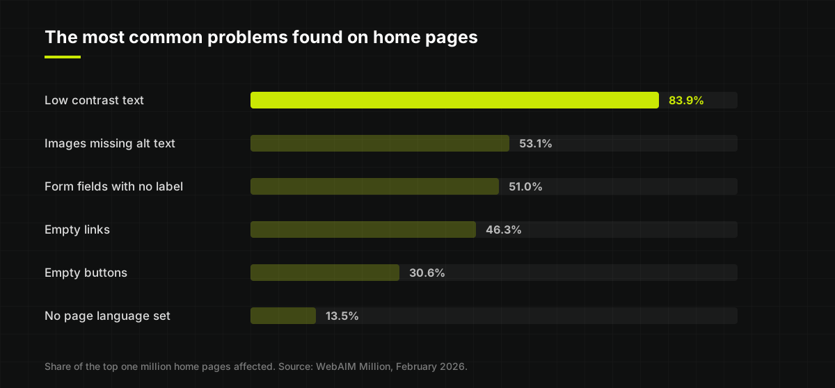
Two things stand out. First, these are not obscure problems. Faint text, undescribed images and unlabelled forms are the everyday stuff of web design. Second, WebAIM is clear that automated tests only find some failures, so the real picture is worse. As the report puts it, the absence of detected errors does not mean a page is accessible.
The encouraging reading is the same one. If most of the web is failing on six predictable things, a small business that gets those six right is already ahead of the large majority of sites, including many belonging to much bigger companies.
Colour and contrast
Low contrast text is the single most common failure on the web, and it is usually a style choice: light grey on white, white on pale photographs, brand colours that look lovely on a designer's calibrated screen and disappear on a cheap phone in a sunny car park.
The numbers to know
WCAG measures contrast as a ratio between the text colour and the background. The WebAIM contrast checker sets out the thresholds for level AA:
- Normal text needs a ratio of at least 4.5 to 1.
- Large text needs at least 3 to 1. Large means roughly 24 pixels, or about 19 pixels if it is bold.
- Buttons, form borders and meaningful icons need at least 3 to 1 against what is around them.
You do not need to calculate anything. Put the two colours into a checker and it tells you whether they pass. Try it with the grey you use for small print; it is the one that fails most often.
Never rely on colour alone
For somebody who is colour blind, a form that turns a field red to show an error, or a price list that marks sold out items in grey, says nothing at all. Anything that colour communicates should also be said in words or shown with an icon: a message reading that the phone number is missing, an underline on links, the word unavailable next to the item.
Text on photographs
White text laid over a photograph is a favourite of website templates, and it fails as soon as the bright part of the picture sits behind the words. If text has to go over an image, put a solid or strongly shaded panel behind it, and check it on a phone as well as a laptop, because the crop changes.
Images and alt text
Alternative text, usually called alt text, is a short written description attached to an image. Screen readers read it aloud, it shows if the image fails to load, and search engines use it to understand the picture. Just over half of the home pages in the WebAIM study had images without it.
How to write it
Describe what the image is there to tell somebody, in the context of the page, as briefly as you would if you were describing it over the phone. Two examples of the same photograph on different pages:
- On a bathroom fitter's project page: Finished walk-in shower with grey slate tiles and a glass screen, in a loft conversion in Harrogate.
- On the same fitter's about page: Dan fitting a shower tray.
There is no need to start with image of or photo of, since screen readers already announce that it is an image. Do not stuff it with keywords either. Alt text written for search engines instead of people reads badly aloud and does not help the ranking it was written for.
When an image needs no description
Purely decorative images, such as a background texture or a flourish beside a heading, should have empty alt text, so that screen readers skip them rather than announcing a meaningless file name. This is a deliberate choice, not a missing one, and it is a detail a good builder handles without being asked.
Words inside pictures
The worst image problem for a small business is text that exists only as a picture: a menu photographed and uploaded, opening hours on a graphic, a price list saved as an image, a special offer written into a banner. Nobody using a screen reader can read it, it cannot be enlarged cleanly, and search engines cannot see it either. Put the words on the page as real text. It is the same reason we build restaurant sites with the menu as a proper page instead of a photo of the card.
Headings, links and page titles
People using screen readers rarely listen to a page from top to bottom. They jump between headings to find the section they want, or ask for a list of links, in the same way a sighted person skims. That only works if the page is built with real structure.
Headings in order
Each page should have one main heading that says what the page is, then section headings beneath it in a sensible order, the way a report has a title, chapters and sub-sections. The common mistake is choosing heading styles for their size, so that a tagline becomes a top level heading and a genuine section title becomes plain bold text. It looks fine and makes no sense to anybody navigating by headings. There is more on how a page is put together in what a website actually is.
Links that say where they go
A page with six links all reading click here or read more is a list of six identical, meaningless items to somebody who hears the links out of context. Write links that make sense alone: see our bathroom projects, read the full price list, book a table. Empty links, usually an icon with no text behind it, were on almost half the home pages WebAIM tested.
Page titles and language
Every page needs its own title, the text that appears in the browser tab and as the headline in search results. It is the first thing a screen reader announces when a page opens. And every page should declare its language, so a screen reader knows to pronounce the words in English rather than guessing. It is one line of code, and 13.5% of home pages still leave it out.
Using it without a mouse
Plenty of people never use a mouse: people with tremors or limited movement, people using switch devices or voice control, and many blind people, who use the keyboard with a screen reader. A useful test is to put the mouse to one side and try to use your site with the Tab key to move forwards, Shift and Tab to go back, and Enter to choose.
What you are checking for:
- Can you reach everything? Every link, button, menu and form field should be reachable by Tab, in an order that follows the page.
- Can you see where you are? There should be a clear outline around whatever currently has focus. Many sites remove it because a designer thought it looked untidy, which leaves keyboard users guessing.
- Can you open the menu? Menus that only appear when a mouse hovers over them are a classic trap.
- Can you get out again? A pop up, cookie banner or chat window that grabs focus and will not let go can make the whole site unusable.
- Is there a skip link? A hidden link at the very top that appears when you press Tab, letting people jump past the menu straight to the content, saves pressing Tab twenty times on every page.
Five minutes with the Tab key tells you more about how usable a site really is than almost any tool.
Phones, zoom and tapping
Most people will see your website on a phone, and a good deal of accessibility comes down to whether the site respects what people do with them.
- Let people zoom. Some sites switch off pinch to zoom to stop the layout moving. For somebody with low vision that removes the one thing that made the page readable.
- Let text grow. Many people set their phone to use larger text. The page should get bigger with it, without words overlapping or being cut off.
- No sideways scrolling. When text is enlarged or the screen is narrow, the content should reflow into a single column instead of spilling off the side.
- Make things easy to tap. Small links packed close together are hard for anybody with a tremor, arthritis or large fingers, and for everybody on a bus. We build buttons and links at least 44 pixels tall, a widely used rule of thumb, with space between them.
- Do not depend on gestures. If something needs a swipe or a long press, offer a plain button that does the same.
These overlap heavily with simply building a site that works on a phone, which is why we treat them as part of the same job, not an extra.
Forms people can actually finish
Your contact or booking form is where a visitor becomes a customer, so a form that some people cannot complete is the most expensive accessibility problem a small business can have. Half of home pages had form fields with no label.
- Every field needs a visible label. Grey placeholder text inside the box is not a label: it disappears when you start typing, is usually too faint to read, and is often not read out properly.
- Say which fields are required in words, not only with a red asterisk.
- Explain errors plainly, next to the field. Please enter a phone number so we can call you back is useful. A red outline and the word invalid is not.
- Keep what people typed when something goes wrong, instead of clearing the form.
- Avoid puzzles. Picture CAPTCHAs asking people to find the traffic lights are a barrier for many disabled users. There are quieter ways to stop spam.
- Do not time people out on a simple enquiry form. Some people take longer, and that is fine.
The best accessibility fix for a form is often making it shorter. We go through which questions are worth asking in what to put on a small business website, and every field you remove is one fewer field that can go wrong.
And always offer another route. A phone number and an email address alongside the form mean that whoever cannot use it, for whatever reason, can still reach you. That single line is one of the most reasonable adjustments a small business can make.
Words, video and documents
Plain words, short paragraphs
Clear writing is an accessibility feature. It helps people with learning disabilities, people with dyslexia, people reading in a second language, and people who are tired, busy or reading on a small screen, which covers almost all of your visitors at some point. Short sentences, short paragraphs, everyday words, and the most important thing first.
A few habits make text harder to read for many people: long stretches in capital letters, text justified so that uneven gaps open up between words, italics for whole paragraphs, and very long lines on wide screens. None of them are needed.
Video and audio
Videos need captions for anybody who is deaf or hard of hearing, and for the large number of people who watch with the sound off. If a video carries important information, such as how a service works, put the same information in writing on the page too. And never let video or audio start playing on its own: it is startling, it interferes with screen readers, and nobody has ever wanted it.
PDFs
Menus, price lists, brochures and forms uploaded as PDFs are a common trap. A PDF can be made accessible, but most are not, and many are simply scans with no real text in them at all. On a phone they are awkward for everybody. If the information matters, put it on a web page.
Websites built properly, for everybody, free
We design and build small business websites at no charge. No build fee, no design fee, and a free trial so you see what we make before you pay anything.
Be wary of quick fix widgets
If you have looked into accessibility at all, you will have seen products that promise to make a website accessible with one line of code: a small icon in the corner that opens a panel for changing text size, contrast and so on, often sold with claims about compliance.
Be cautious. A widget sits on top of the site; it does not change how the site underneath was built. It cannot write meaningful alt text for your photographs, give your form fields proper labels, or rebuild a menu that only works with a mouse. Many disabled people already have their own tools set up on their devices, and a second set of controls layered on top can get in the way of those instead of helping.
The dependable route is less exciting: fix the handful of real problems in the site itself. For a small business website that is rarely a large job, and once it is done it stays done.
Check your own site in fifteen minutes
You can learn a great deal about your own website in a quarter of an hour, without any technical knowledge. Start with the free tools, then do the checks that need a person.
The free tools
- WAVE, from WebAIM. Enter your web address and it marks up the page with the errors it finds, such as missing alt text, low contrast and empty links.
- PageSpeed Insights, from Google. Best known for speed, it also gives an accessibility score and lists what it found.
- Easy Checks, from the W3C. A short guide to checking page titles, images, headings, contrast, zoom, keyboard use and forms by hand.
Keep one thing in mind: a tool that finds no errors has not shown the site is accessible. The W3C says of its own easy checks that a page could seem to pass them and still have significant barriers. Automated tools are good at spotting missing things and poor at judging whether what is there makes sense.
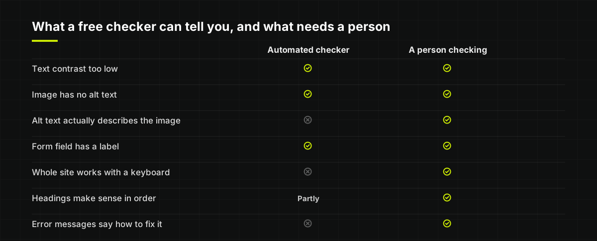
The checks that need a person
| Check | How to do it | What good looks like |
|---|---|---|
| Keyboard | Put the mouse away and press Tab through the page | You can reach and use everything, and always see where you are |
| Zoom | Zoom the browser to 200%, or set your phone to large text | Everything still fits, with no overlapping and no sideways scrolling |
| Images | Run WAVE and read the alt text it shows | Each description says what the image is there to show |
| Headings | Look at the heading outline WAVE lists | One main heading, then sections in a logical order |
| Links | Read the link text on its own | Every link makes sense without the sentence around it |
| Forms | Submit your contact form empty, then with a mistake | Clear messages beside the fields, and nothing you typed is lost |
| Colour | Look at errors, links and labels | Nothing is shown by colour alone |
| Sunlight | Look at the site on your phone outside | Everything is still readable |
If you want to go further, try a screen reader. Phones and computers have one built in: VoiceOver on Apple devices and TalkBack on Android. Turn it on, close your eyes, and try to find your phone number. It is humbling, and it is the fastest way to understand why the rest of this matters.
Saying what you have done
Private businesses are not required to publish an accessibility statement the way public bodies are, but a short one is a good idea. It does not need to be formal. A few lines on a page, linked from the footer, covering:
- That you want the site to be usable by everybody, and what you have done towards that.
- Anything you know does not work well yet, and what you plan to do about it.
- How somebody can get the same information or service another way, such as by phone or email.
- How to tell you about a problem, and that you will do something about it.
Only write what is true. A statement claiming full compliance that the site does not live up to is worse than no statement. Honest and specific is what builds trust, which is also why we tell clients plainly what their site does and does not do.
What goes wrong most
In rough order of how often they turn up on small business websites:
- Faint text. Light grey body copy, and white text over photographs.
- Images with no alt text, or alt text that just repeats the file name.
- Menus, prices and offers as pictures instead of real text.
- Form fields labelled only by placeholder text that vanishes as you type.
- Icon buttons with no name, such as a magnifying glass or social media logos that a screen reader announces as link, link, link.
- Headings chosen for size, not for structure.
- Focus outlines removed, so keyboard users cannot see where they are.
- Pop ups and cookie banners that trap keyboard users or cover the page on a phone.
- Zoom switched off on mobile.
- Nothing but a form to get in touch, with no phone number or email as an alternative.
Every item on that list is cheaper to get right while a site is being built than to fix afterwards, and none of them requires the site to look any less good.
How we build for it
We design and build websites for small businesses with no build fee and no design fee, and every new client starts with a free trial so you can see what we make before you pay anything. Accessibility is part of how we build them, not an extra:
- Text colours checked against the contrast ratios, including the small print and anything laid over a photograph.
- Alt text on the images that need it, written to describe what each one shows, and empty alt text on the ones that are only decoration.
- Real text, not pictures of text, for menus, prices, opening hours and offers.
- One main heading per page and a proper structure beneath it, with a clear page title and the language set.
- Forms with visible labels, errors explained in words, and your phone number and email alongside them.
- Keyboard access, with visible focus and a skip link, and menus that work without a mouse.
- Built for phones first, with zoom left on, text that grows, and tap targets at least 44 pixels tall.
We are careful about what we promise. We build with these checks in mind and test our own work against them, but we do not claim that any site is certified to a particular WCAG level without a full audit, and nor should anybody else. If your business has specific needs, for example a customer base with a lot of older or visually impaired people, tell us at the start and we will design with them in mind from the first sketch.
And once the site is live, changes are part of the service. If a customer tells you something is hard to use, send it over and it gets looked at. If you are deciding between having a site built and doing it yourself in a builder, we compare the two honestly on our free website builder page, and how much a website costs covers what to check before paying anybody.
The checklist
Work down this on your own site, or on any site you are thinking of paying for.
- Body text and small print pass a contrast checker.
- Nothing is shown by colour alone.
- Every meaningful image has alt text that describes it; decorative ones have empty alt text.
- Menus, prices, hours and offers are real text, not images or PDFs.
- Each page has one main heading, sensible section headings and its own title.
- Every link makes sense on its own, and icon links have names.
- The whole site works with the Tab key, and you can always see where you are.
- Pop ups and cookie banners can be closed with a keyboard.
- Zoom works on phones, and text can be enlarged without breaking the page.
- Buttons and links are easy to tap.
- Every form field has a visible label, and errors are explained in words.
- A phone number and email sit alongside every form.
- Videos have captions and never play on their own.
- WAVE and PageSpeed Insights show no errors you have not looked at.
- A short, honest accessibility statement is linked from the footer.
None of this is exotic, and most of it is simply good design done carefully. If you want to understand the experience behind it, charities such as RNIB and Scope have a great deal of practical material. And if you would rather have a site that gets it right from the start, see the kinds of business we build for, whether you are a tradesperson, a salon, a restaurant or something else entirely.